Our approach to building a better website

Disclaimer: this blog was ready to go before coronavirus (COVID-19) threw a pretty big spanner in the works, so this is a little amended introduction to what is a pretty big piece of work!
What we’ve actually just done is go live with an alpha website 6 months earlier than planned. Like many other organisations, we’ve had to alter plans and make rapid decisions under difficult circumstances.
What is interesting is that we’ve not dropped our original plans, rather brought them forward. This is mainly because the need to publish clear, accessible content is now so important that we felt this was our best option.
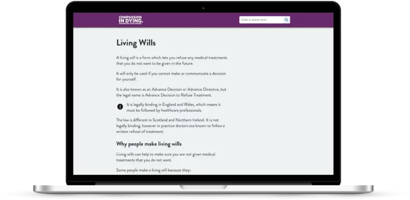
We published some new information for our service users on how they can make decisions about treatment if they get coronavirus. These new pages are underpinned by months of planning, explained in much more detail below.
A new website
In the charity sector, and for those working in digital (whatever that means these days) there is a lot of baggage attached to the term ‘new website’.
Utter the words new website (!) and you will prompt an immediate wish list from everyone and anyone. This is natural, and it isn’t necessarily a bad thing — but chances are you’re starting down a risky path.
Disclaimer: I say this as someone guilty of writing such wish lists.
I think the traditional ‘big bang ’ approach to commissioning, building and launching charity websites is fundamentally broken. I see it time and again in our sector, and I’ve been guilty of this as much as anyone.
As an organisation providing vital information and services for people approaching the end of life, we need to centre the information we provide around our user needs. Anything else is a distraction.
At the end of last year, we put a lot of work into producing a content strategy that now underpins almost all the work we do. So this current ‘new website project’ isn’t in fact a project at all. It’s much more about embedding this new process of researching, producing and testing content.
Thanks to this useful blog, we’re trying to be more focused on outcomes rather than deliverables. Our website is a means to end. People come for the content, not the website.
This is the start of an ambitious journey for us to do things differently and almost start from scratch with the content we provide. It’s fun, and a bit scary.
Some background to why we’re doing this
There are a few big things that we’ve realised needs to change with our current website. So we think it’s now time for a total re-think of how we present information online.
To list a few of these things…
- Our website isn’t accessible, and that’s just not ok.
- We have lots of extremely useful information buried in PDFs. Lots of them.
- People, including our own staff, find the website difficult to use.
- We deal with some complex subjects, but we’re not making things as simple as we could. This means we’re missing an opportunity to help people make important decisions.
That being said, we do get great feedback as well, so we must be doing something right!
I am so grateful for all this help. It’s a difficult process emotionally and you all have helped immensely by setting everything out so clearly and practically.
User feedback
The approach we’re taking
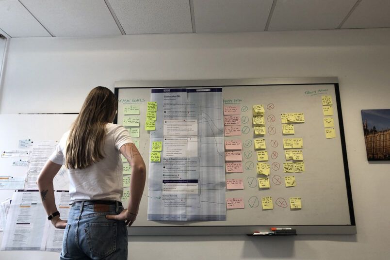
We’re starting small. We’ve identified the four most popular bits of content on our current website and homepage as the core sections we’ll focus on in this first phase.
We’ll also look at the information architecture. How each of these things work together in a way that fits how our users think about them.
Our aim is to deliver an ‘alpha’ website (this is a good explanation of what this means). This ‘alpha’ website is not intended to be a finished product ready to launch to the public.

Once we’re confident these core sections are ready we’ll think about moving into ‘beta’. This may involve inviting a limited number of people to use the website so we can get feedback and improve it.
We will at some point need to add some of the important sections of a charity website like explaining who we are, what we do and the change we want to see and not forgetting the legal bits and bobs.
These bits (and anything else) are deliberately not in scope for this phase.
We’re a small charity. We only have 5 dedicated staff members, with the rest being shared with our sister organisation. We are therefore deliberately limiting the scope of this phase because we:
- are realistic in what we (a small team) can achieve
- want to get our core right, before we think of anything else
- might get bogged down making important decisions at the wrong time
- want to embed a process of doing less, but better
Getting a headstart, courtesy of the NHS
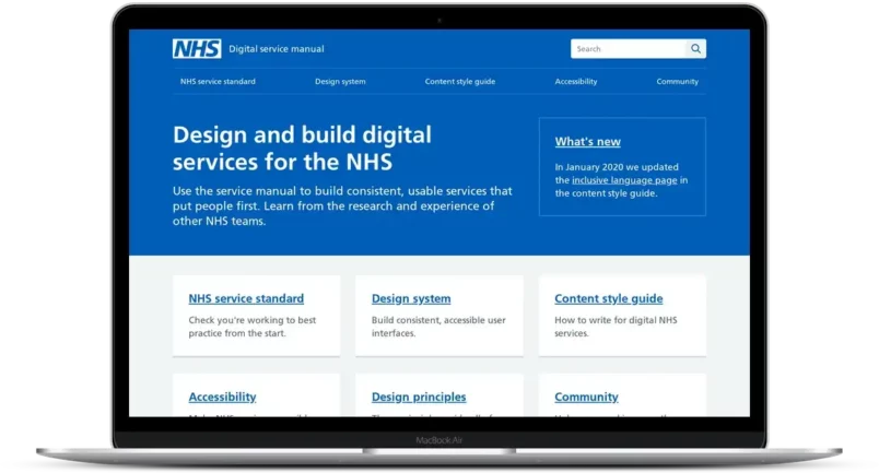
Rather than starting from scratch, we’re adopting the NHS service manual as a starting point.
This amazing resource has been road tested by designers, developers and researchers from the NHS, and the code/designs are publically available.

It will let us prototype quickly. It also has design components which will allow us to test different ways of highlighting content on a page.
Put bluntly, using this manual allows us to punch well above our weight. We simply would not have access to this level of research, design and code otherwise.
It will free us up to focus on our specific user problems and context.
Learning from others (and giving back)
The approach we’ve decided to take is heavily influenced by others who are working in a similar way and are helpfully sharing their work as they go.
Some excellent examples include:
- How Croydon council are building a better website
- A very good blog on explaining what alpha means (and how the definition varies)
- A golden oldie — how the Government Digital Service approached the GOV.UK alpha
- Useful blog series from the team at the Gambling Commission
- Helpful updates from the NHS digital service manual team
It is incredibly useful to see how other teams are approaching the same problems. Added to that those people are open, and more than willing to share when asked (thanks Andy).
In the interests of giving back, we will be attempting to do the same. This blog will be the first of many. We’ll share what we’re working on, what we learn and maybe even an open call out for what we need help with!
We’re also experimenting with a living deck. We’ll use this to document all our work as we go, and it should hopefully help us tell the story of our work easily and coherently. If you fancy a look it’s in Google Slides — would love to know what people think.
That’s enough for now — we’re currently in the midst of usability testing our first prototype and learning lots. Another blog, probably on the nuances of usability vs. content testing will follow soon!
If you’d like to share your thoughts on our work (or yours) we are more than happy to chat — get in touch via Twitter or email.